

FAQ
TURN AROUND TIMES
Our standard turn around time for printing is 12-15 business days. If we are designing your project it usually takes an additional 5-10 business days. If you require your project sooner however, we’d be happy to discuss your requirements and see what we can do. We have a few express options available.
HOW TO DETERMINE THE NUMBER OF COLOURS
When we quote we always indicate how many colours the price includes, this can sometimes get a little confusing as for instance, printing a blind impression with no ink is still considered a colour. When we indicate colours we are actually indicating how many times your piece will run through the printing press. For instance, a business card with red & black on the front and black on the back will be put through the press three times therefore being considered as a three colour job. An invitation with grey, blue and a blind impression all on one side would also be considered as a three colour job.
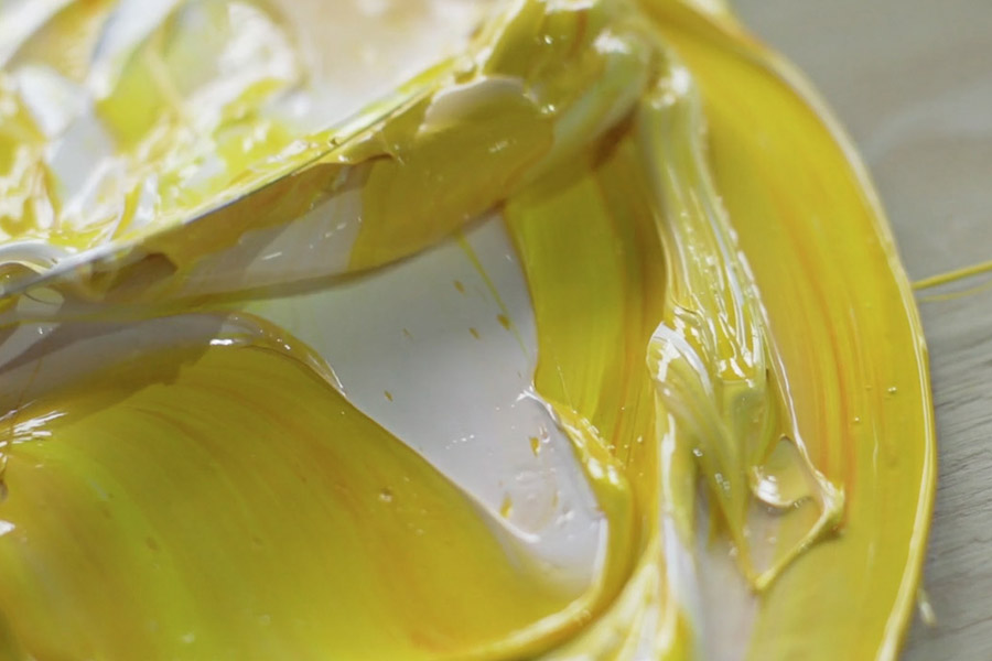
COSTS INVOLVED WITH LETTERPRESS STATIONERY
Letterpress is a time and labour intensive craft that requires great attention to detail. Printing a letterpress project requires printing plates to be made, ink to be hand mixed and then time to get the press set up just right. And this is all before we’ve even taken a print! Therefore as a rough indicator the cost of any letterpress project starts at $250. We offer a ‘250 For $250’ for business cards and for weddings we offer a ‘Save the Date offer’.
WEDDING PACKAGES PRICE LISTS
As we’re a custom letterpress studio, each job differs from the next. That said, we have created some pricing based on popular wedding packages we’ve printed to help give you an idea of costs involved. Otherwise, if you let us know your requirements via our quote form we’ll get back to you with a custom quote as soon as possible.
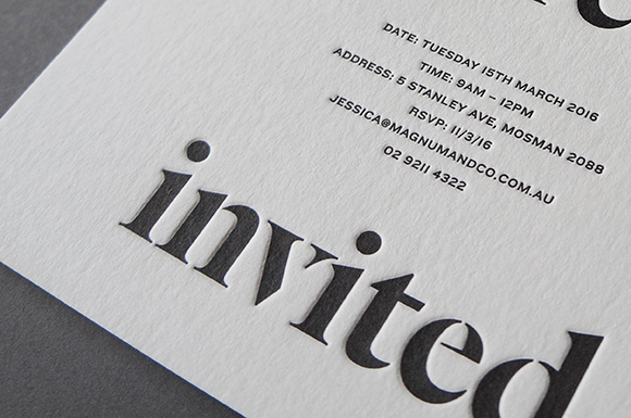
EMBOSS vs DEBOSS vs IMPRESSION
People often refer to the imprint letterpress leaves in the paper as an emboss, however technically an ’emboss’ is raised up from the page whereas a ‘deboss’ is the reverse of this. Traditional letterpress printing leaves what is called an impression in the page with minimal ‘show-through’ on the reverse side of the sheet. At D&D we can achieve all of these techniques but by default we stick to traditional letterpress but with a deep impression using soft cotton and semi-cotton paper stocks. We just thought we’d clear that up for you!
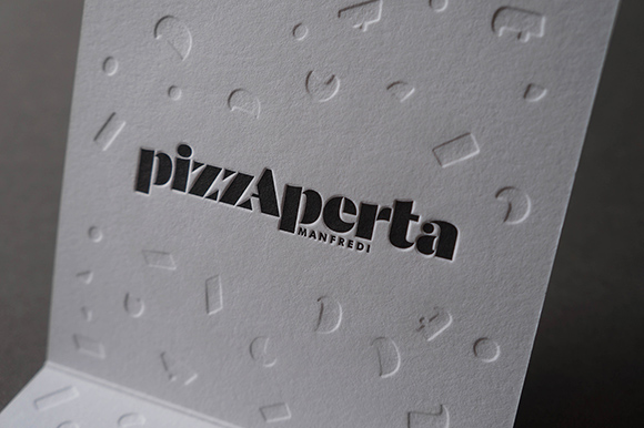
LARGE AREAS OF COLOUR
When creating artwork with large areas of a colour it is worth being aware that letterpress struggles to achieve a nice, even, consistent coverage. Because of a number of factors when printing a large coverage of ink the outcome will be a mottled effect which some other letterpress studios call a ‘salty’ appearance. We think it looks beautiful and an effect that sets letterpress apart from other types of printing but sometimes may not be a desired result. If you have any concerns about your artwork let us know.
Another thing to note about large solid areas is that they can sometimes distort the paper/card that they have been printed on. This can result in the card not being dead flat. It’s not something that is easily predicted as there are a few factors that affect this but its worth being aware.
CUSTOM SHAPES
Not only do our printing presses print beautifully they also can also die-cut (forme cut) almost any shape or we can laser cut/water jet cut if its a little too complex. Contact us for a quote or to chat about your project.
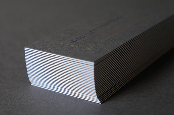
EDGE PAINTING
Edge painting adds that little extra bit of zhush to your stationery. We have a large range of colours available which we can closely match to your selected pantone colours. We find that edge painting gives the best effect on 390gsm+ paper stocks
PERSONALISING WEDDING STATIONERY
Due to the setup involved with letterpress we are unable to letterpress print individual guest names on invitations but we are able to offer digitally printed names onto the invitations or envelopes. We can also offer calligraphy to personalise invitations and envelopes as well as a few other options so let us know if this is of interest.
THE WEDDING STATIONERY PROCESS
We’ve created a guide to help you understand the process of designing and printing your wedding stationery. You can find the steps here
CAN WE GET PROOFS OF THE DESIGN?
We provide digital proofs of your design for approval before any custom design projects go to print. As there is a lot of preparation involved in getting the printing plates made, inks mixed and printing press set correctly, we are unable to provide letterpress proofs of your project. We can however provide samples of previous print work if you would like to see physical examples.
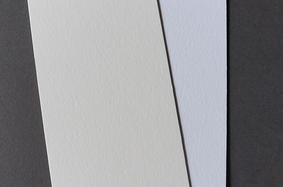
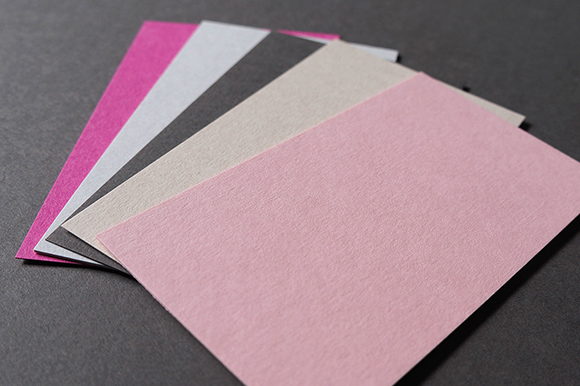
PAPER OPTIONS
We have a large range of beautiful letterpress (and eco) friendly paper stocks that we work with on a daily basis and know intimately. Each paper has its own subtle characteristics making certain papers better suited for various projects (so feel free to ask us what we recommend for your project!). There are two main players in our studio, Gmund & Cordenons Wild, however we do stock a larger range and can source any paper required for a project.
CORDENONS WILD
This paper stock is 35% cotton and comes from an Italian mill. It is a cotton/wood pulp blend (FSC certified) which makes it the most cost effective of our favourite letterpress papers to work with. It is available in a warm white and has a gorgeous fluffy texture, taking the letterpress impression beautifully. It is available in the following weights: 150gsm | 300gsm | 450gsm | 600gsm. Cordenons is our go to paper for wedding invitations and a huge range of other projects.
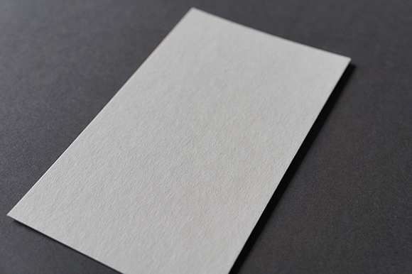
GMUND
I know we shouldn’t have favourite’s but just quietly this is our favourite paper mainly because it makes the letterpress impression so crisp! It is 100% cotton (recycled) and has a smooth texture. It comes in an off white, bright white and a handful of other colours in the following weights 110gsm | 300gsm | 450gsm | 600gsm. Gmund is our recommended paper for a large range of corporate projects and modern/contemporary wedding invitations.
CRANE LETTRA
This paper was specifically designed for letterpress printing and is from an American mill. Like Gmund, this is a premium 100% cotton paper made from recovered fibres from the textile industry (meaning it’s tree free!). It is a happy medium between Cordenons & Gmund for texture and comes in an off white and bright white. Available in 300gsm | 600gsm
COLORPLAN
If we need a coloured paper stock for a project Colorplan is our first stop as it comes in 50 colours and prints remarkably well for a wood pulp paper. Available in 270gsm | 540gsm
COASTER BOARD
This paper is actually what they print beer coasters on and works surprisingly well with letterpress printing! It is a wood pulp paper and comes in a natural off white colour (think unbleached) so suits anything that has a rustic feel… or a limited budget 🙂
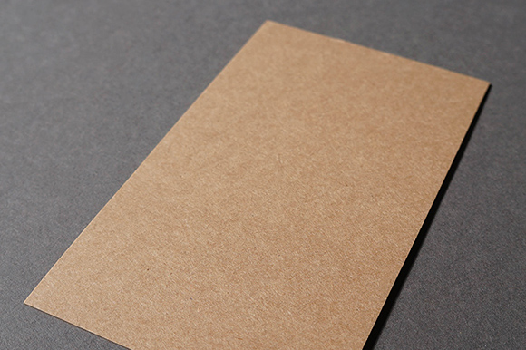
BUFFALO BOARD
This carbon neutral paper is made from natural kraft fibres that are completely recycled. We stock this brown/kraft paper in a 386gsm weight.
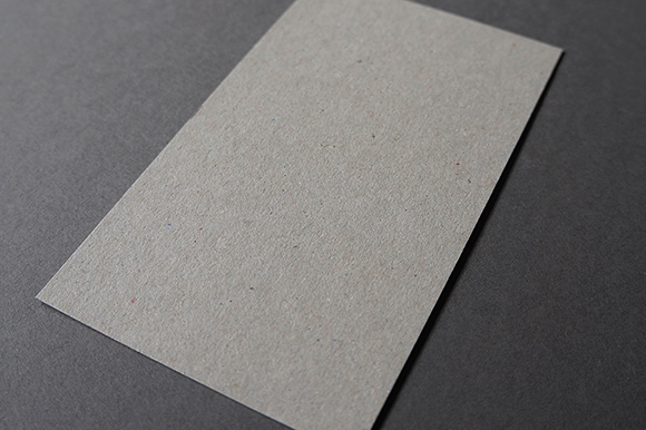
BOX BOARD
Box board is made from 100% post consumer waste so if you’re after something green, rustic or economically priced this could be your paper! Weights on offer 350gsm | 600gsm | 700gsm
DUPLEXING
Do you want to supply us with a design to print?
This guide below should help get your file/s perfectly set up so we can get them quickly into production for you. We don’t take responsibility for any issues that may arise should you not follow these guidelines as we can’t always predict every outcome.